CTA stands for call-to-action. CTA’s are used on most communication channels: email invitations, websites, webshops and blogs. CTA’s already existed before the digital era - they were present in printed media (call or write to…). However, once the ‘one click’ principle occurred CTA’s became greatly important in promotion and communication. After reading this blog, you know how to use your CTA in order to get more registrations for your event.
1. Limit the number of CTA’s in your email invitation
Remember, when it comes to CTA’s: less is more! Make sure you include one clear CTA button in your email. In case you want to add a second call-to-action, make it less prominent so it does not overshadow the primary CTA.
2. Position your CTA buttons smartly
What is the best position for a call-to-action button in your email invitation? Often, a bit of context is needed to understand the CTA. However, you don’t want to place your button too low. The designer term ‘Above the fold’ means ‘everything your reader can see without scrolling down’. This term applies here - and placing your CTA button 'Below the fold' is therefore not recommended.
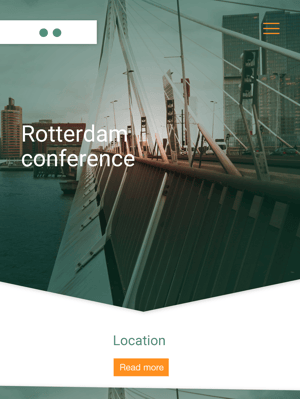
 In this example, the CTA is placed 'above the fold'.
3. Design your CTA button
Colour
You can design the button in a way that matches the style of your organisation or event. Keep in mind that buttons in distinct colours perform best: you want your button to stand out! Pick a colour that is not used in the other design elements in the invitation (header, footer, bullets etc.).
Another important element is the cancellation button. Although your do not want to encourage your invitees to cancel their invitation, it is important to give them the opportunity to do so. You as an organiser need to know who is (not) coming - so you know what to expect. Including a cancellation CTA gives you a realistic image - and leads to lower no-show at your event. Pick a neutral colour for your cancellation button (eg. grey) or choose to use a text link instead.
Size
The size of your button affects the success : a button that is too big might seem showy, whereas a small button can be easily overlooked. Make sure your button is in line with the other design elements of your mail. This is often an intuitive matter, so consider sending your colleagues a test mail when in doubt!
White space
A button with too little space around it can feel cramped. Keep enough ‘white’ space on the sides - and create space around the button itself.
4. Pay attention to CTA texts
Use activating words
Your goal is to make your invitees enthusiastic about the event. In general, using active language in the present tense works best. A few examples:
- Register now
- Sign up
- I want a ticket
- I want to join!
- Yes, I’m in!
Keep it short
Keep your call-to-action short and sweet: aim for 2-4 words per CTA. TIP: Read your CTA out loud - and find out how you can make it even shorter. In most cases, a verb and a time indication are sufficient, eg. Register now!
Make your CTA personal
The first-person perspective makes it easy for your readers to identify with the CTA. A sentence like “I want to join” sound personal and motivating.
Create sense of urgency
Include words like ‘now’, ‘direct’ en ‘free’ in your CTA. Stimulate your invitees to register today instead of next week.
5. Test multiple CTA's
It might be tempting to re-use the call-to-action of your last event. But do not underestimate the power of a CTA. A small change can make a big difference. Try to create a new CTA for your next email invitation, using different colours, texts or button sizes. Don’t implement all changes at once - you want to be able to see what works!
Conclusion
The call-to-action is central to the invitation for your event - and critical for your success. Therefore, it is important to pay attention to the formulation, positioning and design of your CTA. Try to experiment with different types of CTA’s, to get the most out of your mails!

