This is the second blog post of the Insight Session Series: Create the perfect communication flow for your event. In our previous blog we focussed on the content of an email campaign. The following blog is about the importance of layout for a successful event email campaign.
Design improves the user experience
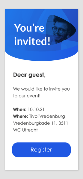
The design of an event email has a functional role, and is not only to make it ‘more beautiful’. A great design improves the user experience. A better user experience results in a time saving and more effective event experience for your attendees.
The design consists of these elements: Header, plain text, footer and background. Here is how to design an event email in 3 easy steps:
Step 1. The header and footer help structure the email
Place the company logo or event image in the header to make sure the reader knows who the sender is. Use the footer to support the overall design of the mail. The header and footer separates the layout of the email and offers a easy to read design.
Step 2. Plain text needs to be designed as well
The text in the email exists to inform your recipient about details. But be short and sweet! No one reads 300+ word emails. Use the guidelines in our previous blog to make the event email as easy as possible to read.
Step 3. Colour your email with brand style colours
Make sure the event email has the same look & feel as your event website. Brand or logo colours are a good reference. Use one or two colours for a clean email design. You do not want to distract your reader from the message.

Conclusion
The layout of the event email is one of the most important elements of the user experience (UX). It makes the mails easier to read and adds value to the consistency of the event branding. You’ll notice better results on your calls-to-action.
The next blog will cover email settings and statistics. We dive into deliverability, bounces and spam details.

